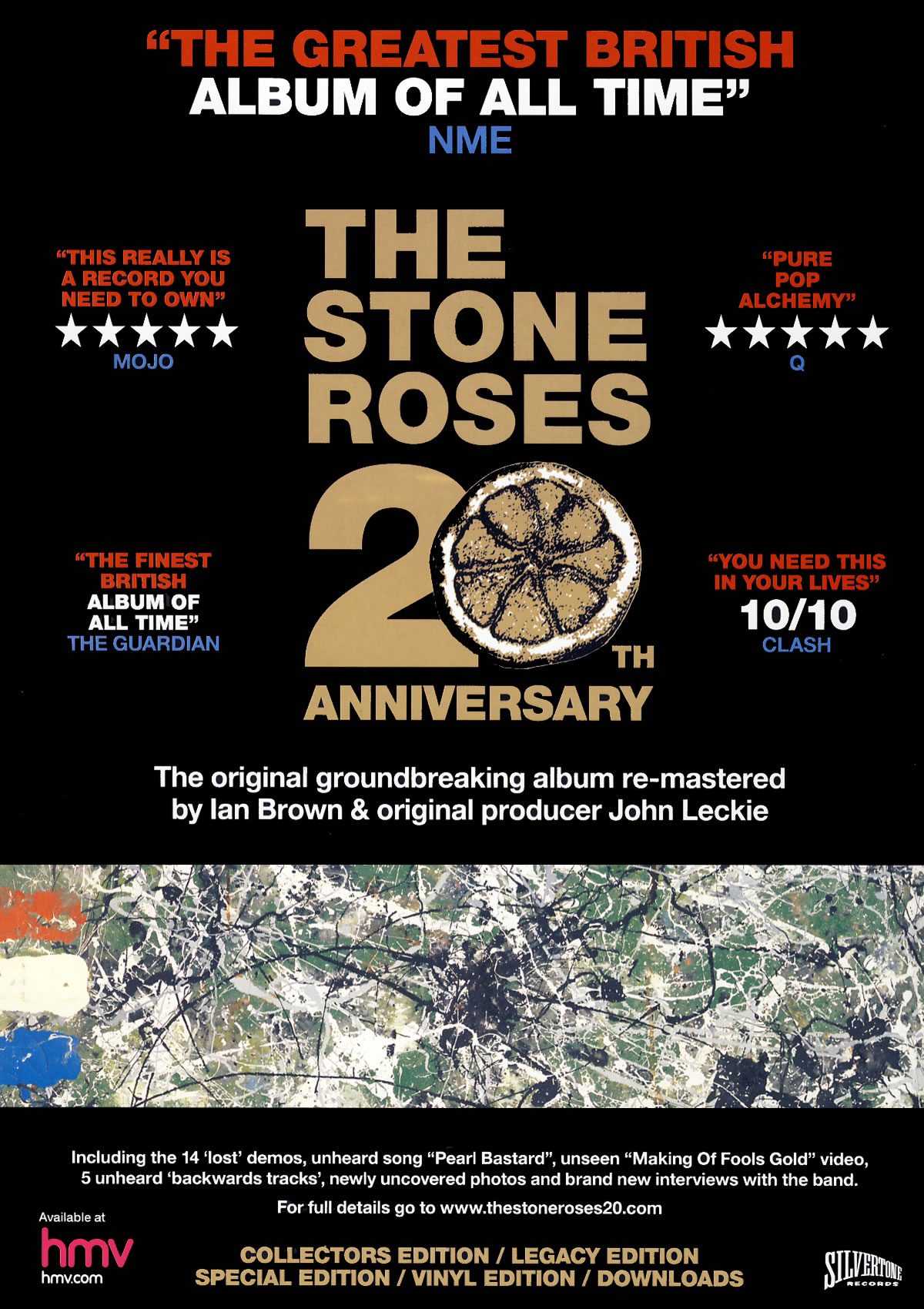
Description
|
Signifier
|
Signified
|
|
Layout
|
This is an album
advertisement for ‘The Stone Roses 20th Anniversary’ which is
rated very highly in the music world.
|
- Symmetrical rating
reviews.
- No band image
-Lower image |
- This has been
designed to be neat and professional.
- This shows me that
the band is also already popular as they don’t need to include a picture of
themselves because almost everyone already knows who they are.
- this is a snapshot
of some previous artwork that the stone roses have used which will
automatically appeal to older fans who will be hoping the songs off this
album will be on it.
|
Typography
|
- Bold clear font
-bright fonts (red,white,blue,gold) |
- this font is very
clear and not fancy as it has no needs to be they are a classic band with
classic style they have no need to be fancy.
- the bright fonts
indicate to me that they want all the text to be seen. I like how all of the
informative text is red white and blue like the colours on the image. Also,
the title is in gold which shows value and sacredness about the album.
|
|
Colour
|
-Black background
|
- The black background
works well because the other colours contrast against it making the text
easily visible.
|
|
Image
|
- Central text (title)
|
- The central text is
simply the name of the album and band which shows me that the name is enough
to sell this because of their reputation.
|
|
Content
(informative)
|
- Reviews, editions,
title, featured songs and people involved.
|
- these details could
possibly persuade people to but it, especially when they mention the ‘unheard
song’
|

Description
|
Signifier
|
Signified
|
|
Layout
|
This album advert is
for Olly Murs’ album ‘Right Place Right Time’.
|
-All writing down
right side
-image on the left
hand side
|
-The writing down the
right hand side basically makes it easy for the viewer to see information.
-the image being on
the left means there is space on the right for text and also means it can be
very large meaning it’s easier to see.
|
Typography
|
-Laid back writing
|
-This writing looks
more like hand writing than a typed font which tells me they are trying to
put a point across that this album is fun and laid back at the same time.
|
|
Colour
|
-Background (Sky Blue)
-Text (Maroon, black)
|
-the background being
this colour sets a joyful feel to the advert. This is a peaceful and calm
colour which again links in with the idea of the album being laid back.
-The text being these
colours really stands out in contrast to the background making it easy to
read. Also, I noticed that the maroon links in with the straps on his braces.
|
|
Image
|
-large image of Olly
Murs
|
-this image is big so
people will recognise him, especially those who take a liking to him. Also,
because it is him you may see him before the text which means if you’re a fan
you won’t even need to read the text
|
|
Content
(informative)
|
-Important information
|
- Who’s album it is,
what it’s called, when it is out, which tracks it features and the website.
|
Double Page Spread

Description
|
Signifier
|
Signified
|
|
Layout
|
This double page
spread interview is with Bob Marley’s son, Ziggy Marley.
|
-Image on the left
hand side, out of the way of the text.
-Text in front of the
image.
|
-the image being out
of the way of the text on its own page means it will attract audiences to
stop and look at this spread which may cause them to read the interview.
- this indicates that
it is his name so people know straight away who the interview is about
|
Typography
|
-Clear font in the
interview.
-jazzy font.
|
-the font used in the
interview is clear as it is the main body of the spread and therefore has to
be easy to read.
-this indicates the
genre of this artist and also his culture.
|
|
Colour
|
-Colourful
(green,gold,red)
-Red text when question is being asked.
|
-These colours
represent Ziggy’s roots as he was born and raised in Jamaica and these
colours represent jamiaca and the Rastafarian culture.
-this shows the question being asked clearly.
|
|
Image
|
-Medium shot of Ziggy
Marley.
|
-this picture shows us
what he looks like, reveals his culture and signifies his genre of musiic
|
|
Content
(informative)
|
-The interview
|
- audiences that like
Ziggy or are interested in him may want to read this.
|

Description
|
Signifier
|
Signified
|
|
Layout
|
This double page
spread interview is with Olly Murs.
|
-Image on the right
hand side, out of the way of the text.
|
-the image being out
of the way of the text on its own page means it will attract audiences to stop
and look at this spread which may cause them to read the interview.
|
Typography
|
-Clear font in the
interview.
-jazzy font.
|
-the font used in the
interview is clear as it is the main body of the spread and therefore has to
be easy to read.
-this indicates the
genre of this artist and also his culture.
|
|
Colour
|
-Colourful, Christmas
colours
-Red text when
question is being asked.
|
-these colours leave a
festive feel about the spread as it is around Christmas time and also shows
that this interview is going to be Christmas based.
-this shows the
question being asked clearly.
|
|
Image
|
- shot of Olly Murs
|
-this picture shows us
what he looks like, reveals his culture and signifies his genre of musiic
|
|
Content
(informative)
|
-The interview
|
- people interested in
Olly Murs will want to read this.
|

No comments:
Post a Comment