Upon Shore Font Evaluation
i decided to use the font that i used for my band 'Upon Shore" because i believe that it communicates the correct meaning of what genre the band intends to target which is the indie genre. i believe that this font clearly merges into the indie category making it good on the eye for fans of indie music.
Thursday, 21 November 2013

Pre-Production
Print: Double Page Spread


For my double page spread I want the band to appear as cool but relaxed at the same time. To achieve this I will use a font that is rough but sharp at the same time with a hint of indie as the bands main headline font. I believe this will portray the desired effect. I Then, will use the image below as picture taken during the interview, the way we are dressed will show that we are relaxed and humble people.
I edited this photo in Photoshop to give the black and white effect.
the font i used was 'Tahoma' as it is found easy and clear to read by most people, thus making it an obvious choice for a double page spread.
Colours used were black white and red as i feel that it shows the readers what type genre we are as a band.
I am going to create an Upon Shore band logo and a New Tunes Records logo which will be used on all 3 platforms.
Here is the finshed result:
Album Ad
For my album poster i want to show a different side to the band and to achieve this i'm going to use brighter colours such as pink and gold. The custom font is going to be used too. The font again was used as it was very clear. I have already edited the two images that are going to be used in this. They are shown below.
I Think these images will achieve the desired effect due to the colours used.
Here is the finished result:
Website E-Media
I want my album to be easy on the eye so i am going to use calm colours which will most likely be shades of blue. The font for the body text will be easy reading however the page headers will be a rough busky style font to remind them of what genre of music we actually are. Also, the main font i chose for the band will be used on most pages as i didnt want to overload the website with images.
Here is the finished result (Home page):
Intentions
Treatment
Brief 3
Print
E-Media
What
do you intend to produce? (Ideas Synopsis)
I intend be doing a full page advert for Upon Shore’s album to run in the press,
a half a page advert for the tour to be run in the press and a two page spread of a prepared interview with the
band for inclusion within a specific publication presented using the
publications presented using the publications house-style and including original
photographs for illustration and (c) e-Media where i will be creating a 3
page extract from the official website of the act. This website will supplement
the social networking websites already utilized and attempt to present a more
'professional' image for the act.
Intentions
based on research
Genre Sub-Genre
Music
Marketing Indie
Generic
Conventions (Link to the specific platforms you are working in
- indie style band name easily linked to the indie genre
- casual attire (shirt and jeans)
Audience
and how they will be targeted
The target audience for me is all fans of
good music, obviously with Upon Shore being an indie band the main target would
be fans of indie music. They will be targeted by advertisements of our indie
productions which we will ensure will tailor to their tastes.
Institution
New
Tune Records
Influences
·
Bastille
·
Mumford & sons
Typography/Layout/Navigation/Interactivity
Generic Conventions
·
Arial Font (Red, Beige, Sky Blue)
·
Upon Shore (Unique name and rolls off
the tongue easily)
Characters
Lead Singer ( ) 2 Guitarists ( ) & (
)
Settings/Locations
·
Brick wall or street environment.
Props/Costumes/Mise-en-scene
·
Two guitars for the guitarists
·
Mic and mic stand for lead singer
·
Jeans and casual shirt/top
·
Casual body language
·
smiling
Image/Lighting
(Moving Image/Still)
·
Bright lighting to set happy mood.
Use
of Sound
·
Preview of tracks on website to give fans a taster.
Editing
and Effects
·
Create a retro effect for magazine
cover to suit the Indie genre.
Research
I have decided to choose Brief Three because I have a lot of interest within the music industry and I think the idea to do this brief sounds good. I am going to be doing tasks (b) Print where i will be doing a full page advert for an album to run in the press, a half a page advert for the tour to be run in the press and a two page spread of a prepared interview with the band for inclusion within a specific publication presented using the publications presented using the publications housestyle and including original photographs for illustration and (c) e-Media where i will be creating a 3 page extract from the official website of the act. this website will supplement the social networking websites already utilised and attempt to present a more 'professional' image for the act.


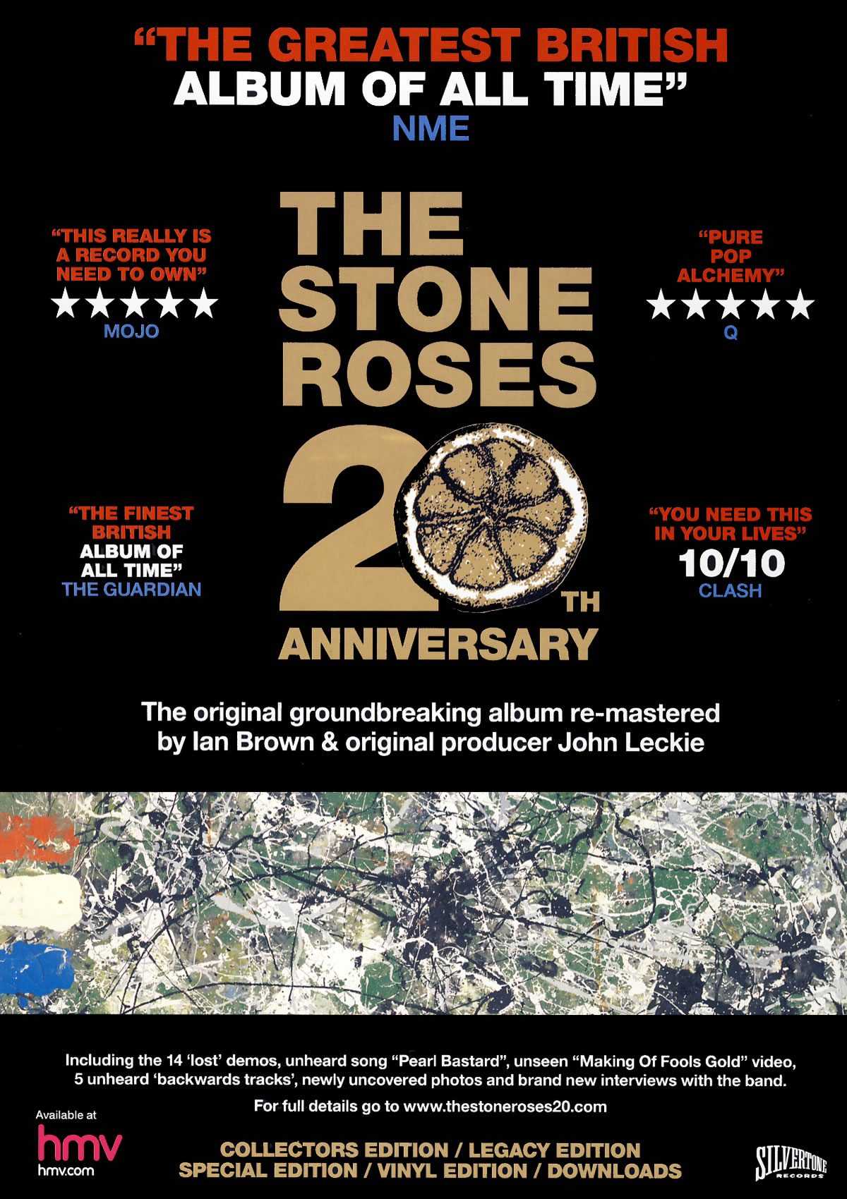
Description
|
Signifier
|
Signified
|
|
Layout
|
This is an album
advertisement for ‘The Stone Roses 20th Anniversary’ which is
rated very highly in the music world.
|
- Symmetrical rating
reviews.
- No band image
-Lower image |
- This has been
designed to be neat and professional.
- This shows me that
the band is also already popular as they don’t need to include a picture of
themselves because almost everyone already knows who they are.
- this is a snapshot
of some previous artwork that the stone roses have used which will
automatically appeal to older fans who will be hoping the songs off this
album will be on it.
|
Typography
|
- Bold clear font
-bright fonts (red,white,blue,gold) |
- this font is very
clear and not fancy as it has no needs to be they are a classic band with
classic style they have no need to be fancy.
- the bright fonts
indicate to me that they want all the text to be seen. I like how all of the
informative text is red white and blue like the colours on the image. Also,
the title is in gold which shows value and sacredness about the album.
|
|
Colour
|
-Black background
|
- The black background
works well because the other colours contrast against it making the text
easily visible.
|
|
Image
|
- Central text (title)
|
- The central text is
simply the name of the album and band which shows me that the name is enough
to sell this because of their reputation.
|
|
Content
(informative)
|
- Reviews, editions,
title, featured songs and people involved.
|
- these details could
possibly persuade people to but it, especially when they mention the ‘unheard
song’
|

Description
|
Signifier
|
Signified
|
|
Layout
|
This album advert is
for Olly Murs’ album ‘Right Place Right Time’.
|
-All writing down
right side
-image on the left
hand side
|
-The writing down the
right hand side basically makes it easy for the viewer to see information.
-the image being on
the left means there is space on the right for text and also means it can be
very large meaning it’s easier to see.
|
Typography
|
-Laid back writing
|
-This writing looks
more like hand writing than a typed font which tells me they are trying to
put a point across that this album is fun and laid back at the same time.
|
|
Colour
|
-Background (Sky Blue)
-Text (Maroon, black)
|
-the background being
this colour sets a joyful feel to the advert. This is a peaceful and calm
colour which again links in with the idea of the album being laid back.
-The text being these
colours really stands out in contrast to the background making it easy to
read. Also, I noticed that the maroon links in with the straps on his braces.
|
|
Image
|
-large image of Olly
Murs
|
-this image is big so
people will recognise him, especially those who take a liking to him. Also,
because it is him you may see him before the text which means if you’re a fan
you won’t even need to read the text
|
|
Content
(informative)
|
-Important information
|
- Who’s album it is,
what it’s called, when it is out, which tracks it features and the website.
|
Double Page Spread

Description
|
Signifier
|
Signified
|
|
Layout
|
This double page
spread interview is with Bob Marley’s son, Ziggy Marley.
|
-Image on the left
hand side, out of the way of the text.
-Text in front of the
image.
|
-the image being out
of the way of the text on its own page means it will attract audiences to
stop and look at this spread which may cause them to read the interview.
- this indicates that
it is his name so people know straight away who the interview is about
|
Typography
|
-Clear font in the
interview.
-jazzy font.
|
-the font used in the
interview is clear as it is the main body of the spread and therefore has to
be easy to read.
-this indicates the
genre of this artist and also his culture.
|
|
Colour
|
-Colourful
(green,gold,red)
-Red text when question is being asked.
|
-These colours
represent Ziggy’s roots as he was born and raised in Jamaica and these
colours represent jamiaca and the Rastafarian culture.
-this shows the question being asked clearly.
|
|
Image
|
-Medium shot of Ziggy
Marley.
|
-this picture shows us
what he looks like, reveals his culture and signifies his genre of musiic
|
|
Content
(informative)
|
-The interview
|
- audiences that like
Ziggy or are interested in him may want to read this.
|

Description
|
Signifier
|
Signified
|
|
Layout
|
This double page
spread interview is with Olly Murs.
|
-Image on the right
hand side, out of the way of the text.
|
-the image being out
of the way of the text on its own page means it will attract audiences to stop
and look at this spread which may cause them to read the interview.
|
Typography
|
-Clear font in the
interview.
-jazzy font.
|
-the font used in the
interview is clear as it is the main body of the spread and therefore has to
be easy to read.
-this indicates the
genre of this artist and also his culture.
|
|
Colour
|
-Colourful, Christmas
colours
-Red text when
question is being asked.
|
-these colours leave a
festive feel about the spread as it is around Christmas time and also shows
that this interview is going to be Christmas based.
-this shows the
question being asked clearly.
|
|
Image
|
- shot of Olly Murs
|
-this picture shows us
what he looks like, reveals his culture and signifies his genre of musiic
|
|
Content
(informative)
|
-The interview
|
- people interested in
Olly Murs will want to read this.
|
Subscribe to:
Posts (Atom)